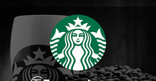
Starbucks Logo History and Evolution: A Complete History (1971-2025)
From Mermaid to Icon: The Fascinating Evolution of Starbucks' Logo 🧜♀️ ☕
I’m so glad you’re here! - Thanks for sticking with me!
Ever wondered how a twin-tailed siren became one of the world's most recognized brand symbols? Our latest blog post takes you on a captivating journey through Starbucks' logo evolution from 1971 to today.
🔎 What You'll Discover:
The mysterious origins of the siren symbol
Key design transformations across five decades
How each redesign reflected Starbucks' expanding vision
The psychology behind the iconic green color
Did you know the original logo was designed for a small coffee shop in Seattle's Pike Place Market? The transformation from that brown, vintage design to today's sleek emblem mirrors Starbucks' journey from local favorite to global phenomenon.
🤔💬 Let’s Chat - Leave a comment!
Are you a Starbucks drinker, What’s your favorite Starbucks beverage? My favorite is a Caramel Frappuccino, I would love you hear from you in the comments.
Happy Reading & Stay Creative!
Andrew Marriott
The Logo Creative™
As I always say - “Stay curious & enthusiastic, and good things will happen!” 👍🏻
Want more brand evolution stories? - Checkout The Famous Logos Section
💡 Loved This Article? Help Me by Spreading the Words and Share the wisdom!
Some Popular Articles From The Logo Creative
21 Examples of Iconic Brand Taglines That Make a Lasting Impact
10 Common Logo Design Mistakes to Avoid for Stronger Branding
Make sure to subscribe so you don’t miss future Issues!


